
Most food photography rules were written for food that does not look like ours. Shallow depth of field. A hero element on a wide plate. Hard light raking across the surface to carve out texture. I have used all of it. On a plate of seared protein with a green vegetable and a pale starch, it works beautifully. On a bowl of torkari it produces a brown smear in soft focus. Everyone at the table then wonders why the picture looks worse than the food of South Asia.
I shoot in Bangladesh, and most of my commercial work is for restaurants here. But the problem is not a Bangladeshi one. South Asian food photography runs into the same wall from Lahore to Colombo. The reasons are structural. And the advice available to photographers here was almost entirely written somewhere else.
The conclusion I keep arriving at is uncomfortable for the canon. These rules are not universal truths. They describe one cuisine’s geometry, written by people who only ever had to photograph that cuisine.
Quick Facts
The core problem: most everyday South Asian dishes carry very little hue contrast and sit inside deep bowls.
Aperture: f/5.6 to f/11. Not wide open.
Main light: large, soft, placed behind the dish rather than beside it.
Camera angle: roughly 30 to 45 degrees above the table surface.
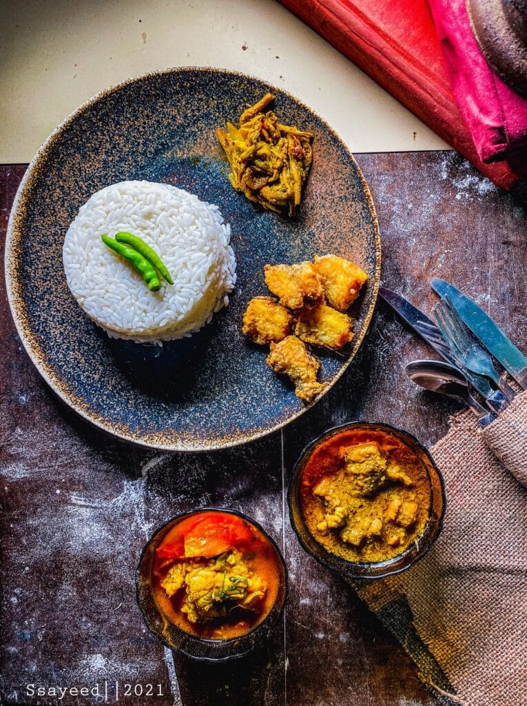
Source of contrast: the surfaces, the steel, the enamel, the greens. Not the food.
White balance: set from a gray reference. Brown food gives your eye nothing to correct against.
What makes South Asian food photography different?
The food has almost no hue separation. The standard rules assume hue separation exists.
Look at what a Western plate gives a camera. A piece of protein with a dark crust. A green vegetable beside it. A pale starch. A sauce in a third color, placed deliberately. Four distinct hues, four distinct shapes, each with a clean edge. The plate was composed by a chef who knew a camera might come.
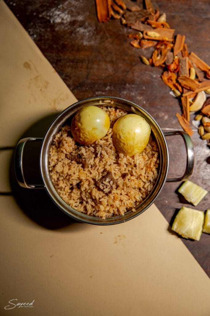
Now look at torkari, or dal makhani, or nihari, or a korma. The solids, the gravy, the spice, the oil floating on top. All of it sits in a narrow band of amber through to deep brown. The chroma variance across the whole frame is tiny. Biryani is worse, or better, depending on how you feel about a challenge. Rice, meat, potato, egg, ghee. One tonal mass, broken only by grain.
This is not a flaw in the food. It is a flaw in the assumption. Every rule about separating a hero element assumes there is a hero element to separate.
Do standard food photography rules work for brown food?
No. The three load bearing rules fail for different reasons. It is worth knowing which reason applies.
Shallow depth of field fails because texture is the only information you have. At f/1.8 you throw away everything except one sharp plane. On a Western plate that is fine. The hero element carries the picture on shape and color alone. On biryani, the content is the grain of the rice, the frayed edge of the meat, the crust on the potato. That texture is the whole image. Blur it and you have photographed a beige cloud. When everything shares a color, sharpness becomes the separation.
Side light fails because our food is wet. Raking light works on dry food with relief geometry. A steak has ridges. Bread has a crust. A gravy dish has a surface of oil and liquid, which reflects. Push a hard source across it from the side. You get a scatter of blown highlights. They read as grease, not as richness. The texture you wanted to carve sits under a liquid film that refuses to be carved.
Negative space fails because it lies about the meal. The empty plate rim, the wide margin, the single bowl floating in a field of white. That grammar comes from menu design and advertising layout, where the product must sit alone. A meal here is not eaten that way. Rice in the middle, four or five bowls around it, hands reaching across. Photograph one bowl in isolation, with generous emptiness around it. You have made a clean image of something that never happens.

Does this apply to every South Asian dish?
No. The exceptions are worth naming, because they show where the line actually falls.
A South Indian thali has real color separation. So does a Sri Lankan rice and curry. The components stay in separate katoris. Yellow dal sits beside green gotu kola, red sambol, white rice. That is hue contrast, and the rules about color hold. Tandoori chicken and seekh kebab sit further outside my argument still. They are dry. They have relief geometry. They come in a red that no Western plate can match. Side light works on a kebab. Use it.
But notice which failure survives even there. The thali is still served in deep bowls on a metal platter, so the angle problem remains. It is still a communal spread, so the negative space problem remains. Two of the three rules still break.
What changes across the region is how much color the plate hands you for free. What does not change is the vessel and the way the meal is eaten. The everyday food of this region sits squarely in the hard case. That means the gravy and rice cooking people eat most days, not the photogenic restaurant outliers.
What lighting works for curry and other wet dishes?
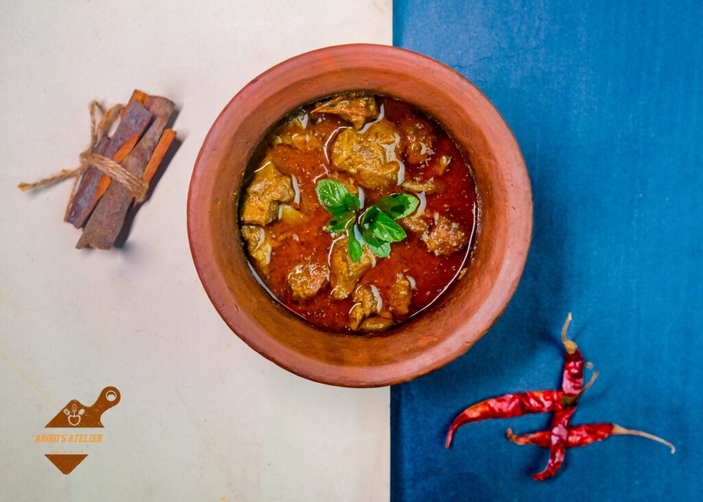
Put the main light behind the dish, make it large, and diffuse it heavily. Backlight turns a reflective surface into an asset.
The reasoning is simple once you see it. Gravy reflects. A small hard source beside the bowl reflects as points. Points read as grease. Now place a large source behind the dish and slightly above. It reflects as a broad gradient across the gravy. The surface ramps from bright at the back to dark at the front. That ramp is dimension. It tells you the gravy has depth, that it is thick, that it moves.
Backlight does three other things that matter here. It catches steam, which is often the only evidence of heat you have. It puts a rim of light on the top edge of the bowl, separating the bowl from the background. It also lights the grains of rice at the far edge from behind. They separate instead of merging.
Then fill the near side. This part is not optional. Brown food that falls into shadow does not become moody. It becomes dead. There is no color information left in the dark end to carry the picture. A white card just outside the frame, on the camera side, is usually enough. I want the shadows open and the tonal range sitting in the upper middle.
What camera settings work for biryani and curry?
Stop down to f/5.6 or f/8. Keep ISO low. Accept a slower shutter on a tripod.
The wide aperture habit comes from portrait thinking, where separating a subject from a background is the whole job. Here the subject is a mass. The background is often another part of the same meal. There is nothing to separate it from. You need the full depth of the bowl sharp, from the near rim to the far one. That lets the eye travel across the texture.
On a tripod, at a stable table, there is no reason to open up. A quarter of a second at f/8 and base ISO gives you a cleaner file. It holds more texture than anything shot wide open.
One more setting matters more here than anywhere else. Set white balance from a gray card on the table, in the actual light. Restaurant interiors across the subcontinent mix tungsten, window daylight and green fluorescent. Often all three sit within a metre. With a portrait you can correct by eye. Skin is a memory color, so you know when it is wrong. Brown food gives you no such anchor. A curry that is four hundred kelvin too warm still looks like a curry. It just looks like a worse one, and you will not be able to say why.
How do you add color contrast when the food is all brown?
Build the contrast into everything except the food.
This single change improves these images fastest. The dish will not supply a complementary color, so the frame has to. The good news is that the real material culture of the meal already contains it.
Steel plates, thalis and katoris give you a neutral cool gray. It sits against warm gravy and never competes for attention. Enamel in blue or green does the same thing with more character. A dark wood table or dark cloth drops the background well below the food in luminance. That pushes the dish forward, with no need for shallow focus. Then add what belongs on the table anyway. Green chilli, a lemon wedge, raw onion, coriander, the deep purple of aubergine.
None of this is styling in the decorative sense. It is all food that is genuinely served with the dish. The contrast comes from the meal being photographed as a meal.
A warning on the edit. Brown saturates into orange very quickly. When an image feels flat, the instinct is to push vibrance. With this food, ten points is enough to look artificial. Work in luminance contrast instead. Lift the separation between the gravy highlight and the midtones of the solids. Leave saturation close to where it started.
What angle works best for food served in a bowl?
Shoot from roughly 30 to 45 degrees above the table. The bowl decides this, not you.
A low angle near the table surface is a staple of the standard grammar. It shows height on a plated dish. Try it on a bati or a katori and the rim hides the food. You photograph a rim. Directly overhead solves that and shows the full mass. It has become the default for anyone shooting curry. But it kills the gravy. From straight above, the reflection ramp collapses and the surface reads as flat paint.
The working band sits between the two. High enough to clear the rim and see the whole surface of the dish. Low enough that the gravy still catches the light from behind and shows you it is liquid. Every bowl has a different answer, depending on its depth. So I move the camera rather than the food.
Are the classic food photography rules wrong?
They are not wrong. They are provincial, which is a more serious charge.
Shallow depth of field, side light and negative space all solve one specific problem. How do you photograph food that arrives with visual separation already built in? They were worked out in studios, shooting cuisines where the chef composes the plate. Components are kept apart. The food was designed with a camera somewhere in its future.
That is a real tradition and a good one. The error is the promotion. Somewhere between the studio and the tutorial, something slipped. Solutions to one cuisine’s geometry became the grammar of food photography, full stop. So a photographer in Dhaka or Karachi opens a guide and applies the rules faithfully to a plate of biryani. The image comes out poor. The conclusion is that the food is not photogenic.
The food is fine. The instructions came from somewhere else.
What I have described above is not a rebellion against technique. It is the same technique, reasoned out again from the actual subject. Low hue variance, so lead with texture and luminance. A wet reflective surface, so light from behind and diffuse. Deep vessels, so raise the camera. Communal service, so fill the frame. Every one of those follows from looking at the food instead of at the canon.
Frequently asked questions
Why does South Asian food look flat in photographs? Most everyday dishes have very little hue contrast. The standard techniques rely on color separation, so they fail. Texture and luminance carry the image instead.
Should I use a wide aperture for biryani? No. Use f/5.6 to f/8. Biryani is a single tonal mass. Its texture is the only information in the frame, and shallow focus destroys it.
Does side light work for curry? Rarely. Gravy is a wet reflective surface. Hard light from the side produces blown highlights that read as grease. A large diffused source behind the dish works better. Side light does work on dry food like tandoori and kebabs.
What angle is best for food served in a bowl? Around 30 to 45 degrees above the table. Lower angles hide the food behind the rim. Shooting from directly above flattens the gravy.
Are standard food photography rules wrong? They are not wrong, they are local. They solve the problems of plated Western food and were mistaken for universal rules.
Discover more from sayeedbm.com
Subscribe to get the latest posts sent to your email.